Grubhub Headquarters – Branded Environment
Located in Chicago, IL
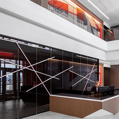
Grubhub’s Chicago headquarters location occupies five floors – each with a slightly different function and design. The online and mobile food ordering company had just finished a corporate rebrand, and was looking for a way to visually connect its five separate floors while incorporating wayfinding to differentiate similar-looking spaces.
Because of the floor layouts, there were also long hallways with huge wall expanses that offered opportunities for collaboration – and a space to show off the company’s new branding.
Shive-Hattery sat down with Grubhub to brainstorm ways to bring its new brand into the space while unifying all five floors in a creative way. Traditional signage methods wouldn’t work well in this space; because of the layout, static wall- or ceiling-mounted signage pointing to conference rooms, restrooms, and break areas would have been overwhelming and confusing.
Taking advantage of the large structural columns in the space, Shive-Hattery designed graphics of the mass-transit lines from each major city that boasts a Grubhub presence. Now, as points of reference, employees can refer to certain areas of the building based on the mass-transit artwork in that space. Digital signage and interactive wayfinding spaces were also designed for the headquarters, allowing users to determine where they are and how to efficiently get to their destination.
To give some personality to the blank coolers, refrigerators, and “phone booths” (private spaces where employees can take calls) scattered throughout the office, Shive-Hattery created graphics to subtly brand these pieces with Grubhub colors and artwork so they looked like an intentional part of the design.
The long white hallways, which were intimidating to look at, were turned into interactive, functional walls to support the tasks and activities taking place in each area. In one instance, an entire wall was transformed into a magnet; a U.S. map graphic overlay lets employees track goals and current Grubhub locations, as well as hang notes about certain geographic areas. In another instance, a wall serves as Grubhub's company timeline, which can be added to as time goes on.
Grubhub’s environmental branding incorporates its new identity and provides wayfinding with personality to suit the technology company. Its five floors now have a unified look and feel with graphics and artwork that improve aesthetics and provide staff with tools to boost creativity and productivity.
Stay in Touch for Monthly Shive-Hattery Industry Insights

West Des Moines, IA
Creating the foundations that support community growth.
Stay on top of the latest industry trends as we share how we are staying ahead of them.


Pre K-12

Pre K-12